Enter password to view case study
Redesigning Manual Review Around Real Underwriting Work
Making pending work visible, coordinating borrower communication, and refining the workflow through testing and post-launch observation.
Product
PlatAI Loan Origination System
My role
Product Designer and design owner for the initiative
Team
Product, engineering, second designer and three client underwriting teams
Contribution
Design and delivery, with early input from a second designer
Status
Released and in daily use

Make Pending Work Visible
When an application fails an automated check, PlatAI creates Manual Review reasons for the items a person must verify. Each reason can have its own document requests, uploads, and review status. One application may contain several parallel investigations.
The original table did not show whether documents were ready for review. Underwriters opened each reason to check. Separate document actions also triggered separate borrower notifications, fragmenting communication across the review.
Before – Manual review tab/Reasons list

Before – Manual review tab/Reasons Page

Workflow Gaps
Pending work was invisible
The table did not show which documents were ready. Underwriters opened each reason to check.
/01
Parallel investigations lacked a shared view
Each reason had its own requests, uploads, and status, but reviewing them required navigating between reason pages.
/02
Borrower messages were fragmented
Separate document actions sent separate notifications, scattering communication across the review.
/03
Reason-level actions needed their own path
The workflow had to support decisions about a reason even when it contained no documents. Testing later exposed a gap in how the proposed design made these actions accessible.
/04
What is ready to review, and what am I committing when I submit?
Testing the Workflow
10
pre-release sessions
5/5
client + internal sessions
5
clickable scenarios
The proposed concept brought reasons and documents onto one board, with decisions held until final submission. We ran 10 pre-release sessions: five with client underwriters and five with internal participants.
Each participant worked through five clickable scenarios while thinking aloud, including revising decisions, updating a reason without documents, requesting documents, and rejecting an application.
The sessions supported the core board interaction and exposed gaps in discoverability and confirmation. One head of underwriting rated ease of use 8/10 and explained the workflow back without help. The observed difficulties led to specific changes.

Evidence Before Commitment
The team questioned the engineering investment: drag and drop, decisions held in a pending state, and a notification model rewritten around submission. Our process used finished designs to define user stories, so accepting the concept meant a substantial implementation commitment.
Our product lead proposed testing before anyone wrote a story. The sessions gave the team evidence about usability and concrete corrections to make before development. They reduced uncertainty about the interaction without resolving every implementation question.
One Board, One Submission
I brought reasons onto one board, each with three document columns: Ready for review, Accepted, and Not accepted. Incoming documents become visible in their review context; underwriters sort them without opening a separate reason page.
Decisions remain pending until submission. Underwriters can review documents, revise choices, and update reasons before sending a consolidated borrower message. This changes both how work is organized and when the system communicates it.
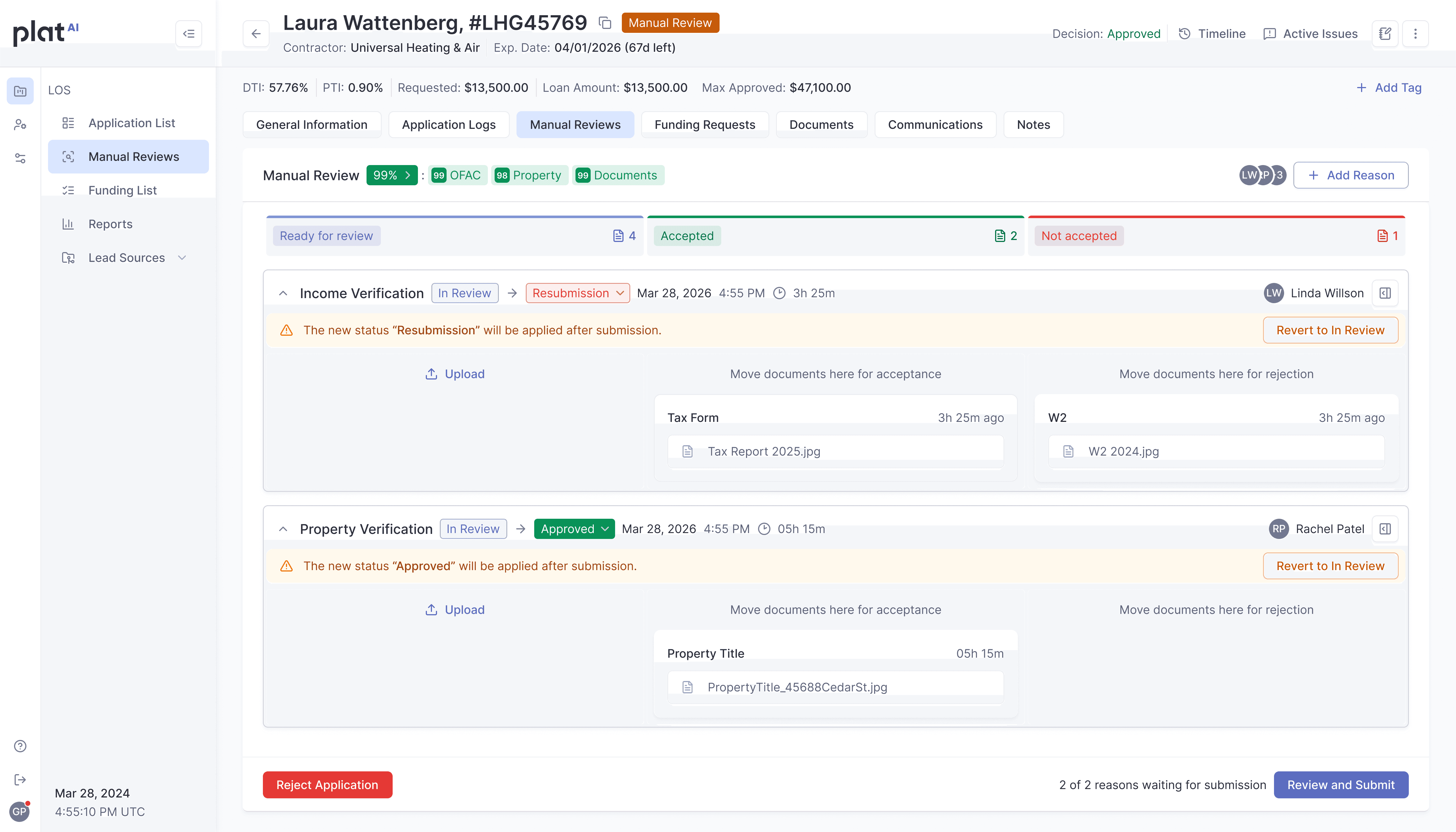
Explain the Submission
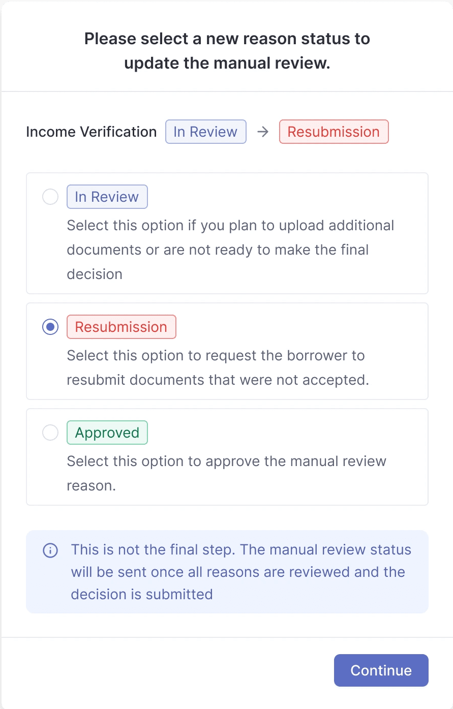
In a scenario with an approved reason and a document marked Not accepted, participants could complete the task but could not clearly explain what they were approving. Submit needed to explain the commitment, not simply complete the interaction.
The revised confirmation names each reason and the status transition being applied, so the underwriter can review the specific changes before committing them.

Precise Upload Time
An underwriter working against a 10-to-15-minute decision SLA needed more precise information than an upload date. Document cards now show upload time, with further timing detail available on open.

Resubmission vs. Rejection
The previous terminology used rejection for two different outcomes: declining a document and ending an application. A participant leading underwriting, call handling, and funding, with experience across four LOS platforms, highlighted the risk: a new hire could end an application when they intended only to request a replacement document.
The redesign uses Not accepted for documents needing replacement. Application rejection remains a separate action with its own confirmation. Resubmission is handled through the final submission flow, with exceptions identified explicitly.
Requesting a better document and ending an application need clearly different actions.


Open Policy Question
One participant proposed manager escalation when an underwriter approves a reason despite a document marked Not accepted. The first release retained the underwriter’s override rather than adding an escalation step.
A notice clarifies that manually uploaded documents will not be included in a resubmission request. That improves visibility into the submission behavior, but it does not resolve who should authorize an exception. Manager escalation remained an open question from testing.
What Live Work Revealed
In a post-release shadow session, I watched an underwriter open bank-statement images individually in separate tabs and count them to keep her place. A single reason could contain around 40 documents because borrowers photographed statements page by page.
The workflow lacked a combined view and in-place rotation for sideways images. Our test scenarios had focused on decisions; the prototype did not contain enough documents to expose this problem.
The session also revealed that a single property-verification trigger covered both property type and property value, leaving underwriters to identify the actual issue manually. Property title verification represented roughly half of this lender’s Manual Review volume.
Planned next iteration: combined document review.
Bring documents into a combined view with in-place rotation.
Identified follow-up need: separate property triggers.
Distinguish property-type and property-value issues. Delivery status is not established in this case study.
These are follow-up improvements, not outcomes claimed for the released redesign.
Change to my process
Stress-test document-heavy prototypes with realistic high-volume cases alongside the core decision scenarios.
A prototype with two tidy documents per reason cannot surface a problem that only exists at forty.
Before / After
The information was always there. What changed was how much work it takes to find it.
Before / Reasons Table
Underwriters opened individual reasons to discover pending work. Document actions generated separate borrower notifications.
After / Review Board
Reasons and documents share one review context. Decisions remain editable until submission, with explicit confirmations and a consolidated borrower message.
My Role
I led product design and delivery for the Manual Review redesign, with early input from a second designer. I partnered with product, engineering, and three client underwriting teams to test the workflow and revise the design before implementation.
My work connected prototype testing, reason-level controls, submission confirmation, document terminology, and post-release observation, from the initial board concept through the shadow session that revealed its limits.
Outcomes & Measurement
Released and in daily use
The redesign introduced the review board, pending decisions, consolidated borrower communication, and distinct document and application actions.
Qualitative evidence
Operational data sits with the lenders running on PlatAI. Five external and five internal pre-release sessions, a later workflow interview, and post-release observation informed this work. They support the usability findings, but do not establish a measured reduction in review time or errors.
Next measures
upload-to-decision time, borrower messages per review, mistaken application rejections, and new-underwriter task success. Segment review time by document volume to evaluate the combined view and rotation in the next iteration.
Design Lesson
Design around the decision.
Test at the volume users actually receive.
© 2026 tetyana.voronova